Create pictographs
Key Notes :
- Understanding Pictographs: Explain to students that pictographs are visual representations of data using pictures or symbols. Emphasize that each picture or symbol represents a specific quantity or number.
- Choosing Appropriate Symbols: Teach them how to select appropriate symbols or pictures to represent the data they want to display. Encourage creativity and clarity in the selection of symbols that clearly depict the information.
- Creating a Key: Introduce the concept of a key or legend in the pictograph. Show them how to create a key that explains what each picture or symbol represents in terms of quantity or numbers.
- Collecting Data: Help students gather data to be represented in the pictograph. This can be done through surveys, classroom activities, or real-life scenarios that are relatable to their level and interests.
- Organizing and Drawing the Pictograph: Guide them on how to organize the data and draw the pictograph using the selected symbols. Emphasize the importance of clarity, neatness, and accuracy in their representations.
- Interpreting the Pictograph: Teach students how to read and interpret the information displayed in the pictograph. Show them how to use the key to understand the quantities or numbers represented by the symbols.
- Making Comparisons: Encourage students to make comparisons and draw simple conclusions from the pictograph. For instance, they could compare which category has more or fewer items, or identify trends within the data.
- Practice and Application: Provide ample opportunities for practice. Offer exercises and activities that involve creating and interpreting pictographs to reinforce their understanding.
- Real-Life Examples: Show real-life examples of pictographs in use, such as signs, charts, and graphs, to help students understand the practical applications of this method of data representation.
- Encourage Creativity: Lastly, foster creativity by allowing students to create their own pictographs using data that interests them. This could include favorite colors, pets, hobbies, or any other relevant subject matter.
Learn with an example
✈️ Use the data in the table to complete the missing row in the pictograph below.
| Annual days of precipitation | |
|---|---|
| City | Days |
| Santa Barbara | 30 |
| Lubbock | 60 |
| Colorado Springs | 90 |
| Stockton | 50 |
- Click to select the umbrellas.
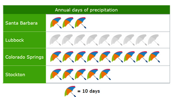
- The missing row is for Lubbock. Find Lubbock in the table. Lubbock gets 60 days of precipitation each year.
- Each umbrella is worth 10 days.
- Divide:60÷10=6Put 6 umbrellas in the Lubbock row.
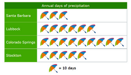
- Your final pictograph should look like this:
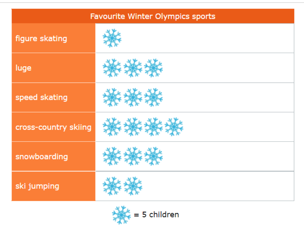
✈️ Use the data in the tally chart to complete the missing row in the pictograph below.
| Favourite Winter Olympics sports | |
|---|---|
| Sport | Children |
| figure skating |  |
| luge | |
| speed skating | |
| cross-country skiing | |
| snowboarding | |
| ski jumping | |
- Click to select the snowflakes.
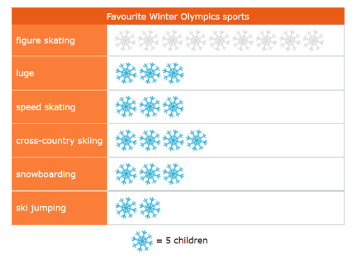
- The missing row is for figure skating. Count the tally marks for figure skating. 5 children chose figure skating.
- Each snowflake is worth 5 children. Divide:
- 5÷5=1
- Put 1 snowflake in the figure skating row.
- Your final pictograph should look like this:
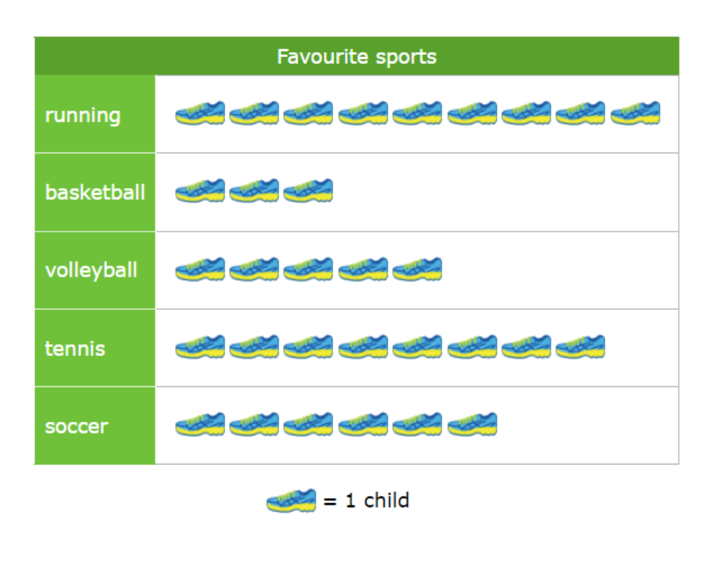
✈️ Use the data in the table to complete the missing row in the pictograph below.
| Favourite sports | |
|---|---|
| Sport | Children |
| running | 9 |
| basketball | 3 |
| volleyball | 5 |
| tennis | 8 |
| soccer | 6 |
- Click to select the shoes.

- The missing row is for tennis. Find tennis in the table. 8 children chose tennis.
- Each shoe is worth 1 child. Put 8 shoes in the tennis row.
- Your final pictograph should look like this:
Let’s practice!🖊️