Interpret line plots
Key Notes :
- Data Representation: Line plots are visual representations of data, where individual data points are shown along a number line. Each ‘X’ or another symbol represents the frequency or occurrence of a specific data point.
- Identifying Data: Students learn to read and interpret the line plot to understand the frequency or number of times a particular value appears in a given set of data.
- Data Analysis: They analyze the plotted data to interpret trends, patterns, and relationships within the dataset. For instance, they might identify which value occurs most frequently or least frequently.
- Understanding Scales: Students grasp the concept of scales on the line plot, recognizing the intervals and how each ‘X’ or symbol represents a single occurrence within that scale.
- Drawing Conclusions: They learn to draw conclusions based on the information depicted on the line plot. This might involve making comparisons between different data points, identifying the most common or least common occurrences, and drawing simple inferences from the data.
- Real-World Applications: Understanding line plots helps students make connections to real-world scenarios, such as tracking daily temperatures, counting objects, or analyzing survey data.
Learn with an example
✈️ Mrs. West’s class counted the number of leaf rubbings they had made.
✈️ Making leaf rubbings
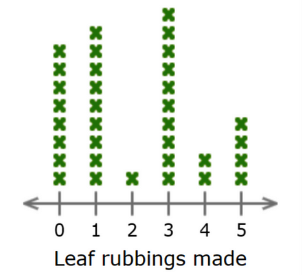
✈️ How many students are there in all?
______students
- Count all the X’s in the line plot. There are 34 X’s. There are 34 students in all.
✈️ A clothing store asked some students how many sweatshirts they owned.
✈️ Sweatshirts

✈️ How many students in the class have exactly 2 sweatshirts?
_______students
- Count all the X’s in the column for 2 sweatshirts. 8 students have exactly 2 sweatshirts.
✈️ For a project, Annie found out how often people played miniature golf last summer.
✈️ Playing miniature golf last summer

✈️ How many people are there in all?
______people
- Count all the X’s in the line plot. There are 27 X’s. There are 27 people in all.
Let’s practice!🖊️